

Redesigning NZAA's life insurance journey
Validated a new life insurance application flow through 4 rounds of usability testing, directly addressing the high drop-off rate between quote and purchase that was limiting NZAA's competitiveness in the New Zealand market.
Role
Lead UX Designer
Team
Led a team of 2 UX designers, collaborating with Solution Architect and Tech Lead
Timeline
8 weeks (4 × 2-week design sprints)
Tools
Figma, Miro

The challenge
Following a major acquisition, NZAA needed to overhaul their life insurance product to compete in the New Zealand market. The existing application journey was functional, but functional wasn't enough anymore.
The user problem
Customers faced repetitive questions, a lengthy completion time, and the frustrating experience of discovering they were ineligible for a product only after investing significant effort. The journey wasn't optimised for mobile and felt disconnected from NZAA's other modern digital products.
The business problem
A high drop-off rate between the quote and final application stages. The cumbersome experience was actively preventing potential customers from completing their purchase.
The goal
Turn an intimidating, jargon-heavy process into something that feels manageable and builds confidence.
My contribution
I led the design effort within a structured 8-week agile process, stepping into a strategic role that combined mentorship with hands-on design leadership.
Designed the sprint framework
Broke the project into four 2-week sprints aligned with customer journey stages, establishing a repeatable cycle of design, prototype, client feedback, and user testing.
Mentored our junior designer
Provided daily direction, facilitated workshops, and ensured quality and consistency across all outputs.
Established the design system foundations
Created component libraries in Figma that enabled our small team to produce screens efficiently and consistently.
Owned strategic oversight
Ensured each step of the journey was validated by users and aligned with project goals.
Key insights
Users wanted descriptive content, not minimal screens
We started with a common assumption: for a "tedious" topic like life insurance, users would prefer the simplest possible screens. Our first sprint testing revealed the opposite. While users did want a direct path, they were suspicious of pages with very little text. They expected a serious topic to have substance. This immediately challenged our "less is more" hypothesis.
Simplicity is context-dependent
Later testing showed users actively seeking out supplementary information, willing to click more to access it. The pattern became clear: efficiency in the core application flow, but comprehensive support available on demand. Users wanted to move fast through the main journey, then slow down when making their actual decision.
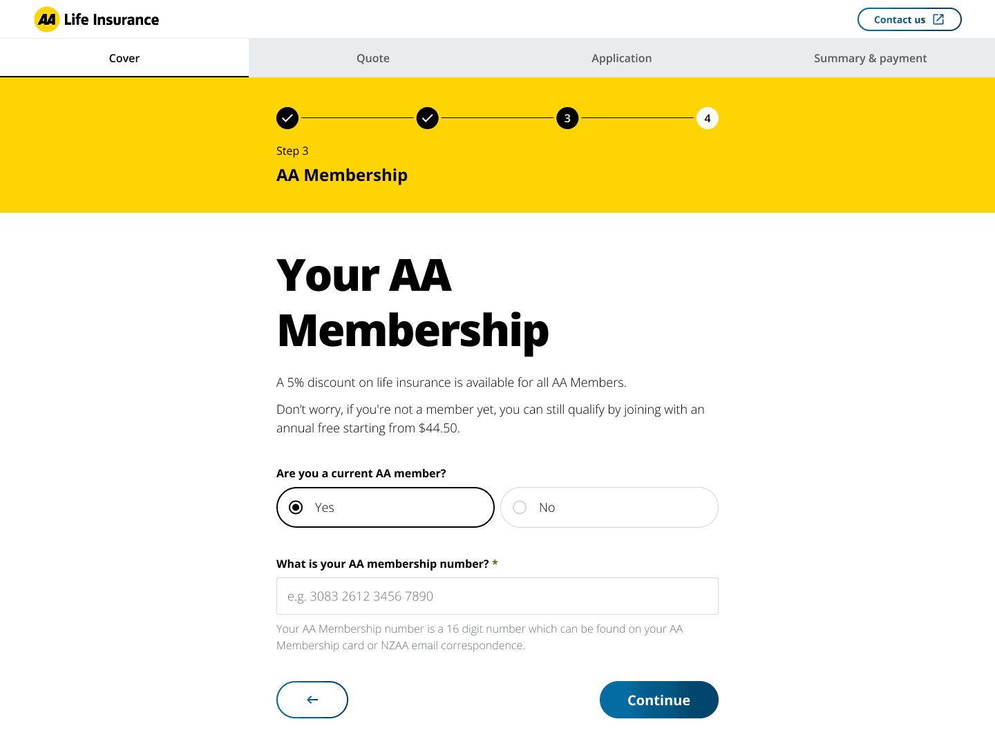
Value needs to surface early
We found that presenting member discounts and positive "sweeteners" early in the journey created immediate goodwill. Non-members responded well when we showed they could still access discounts by signing up later, rather than making membership feel like a barrier.
The solution
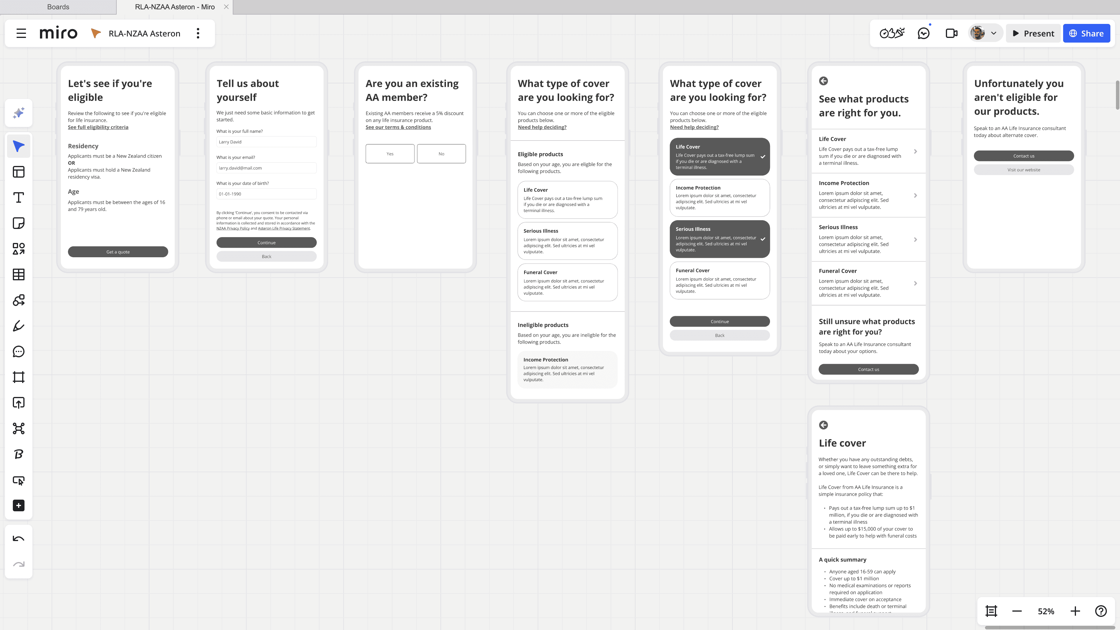
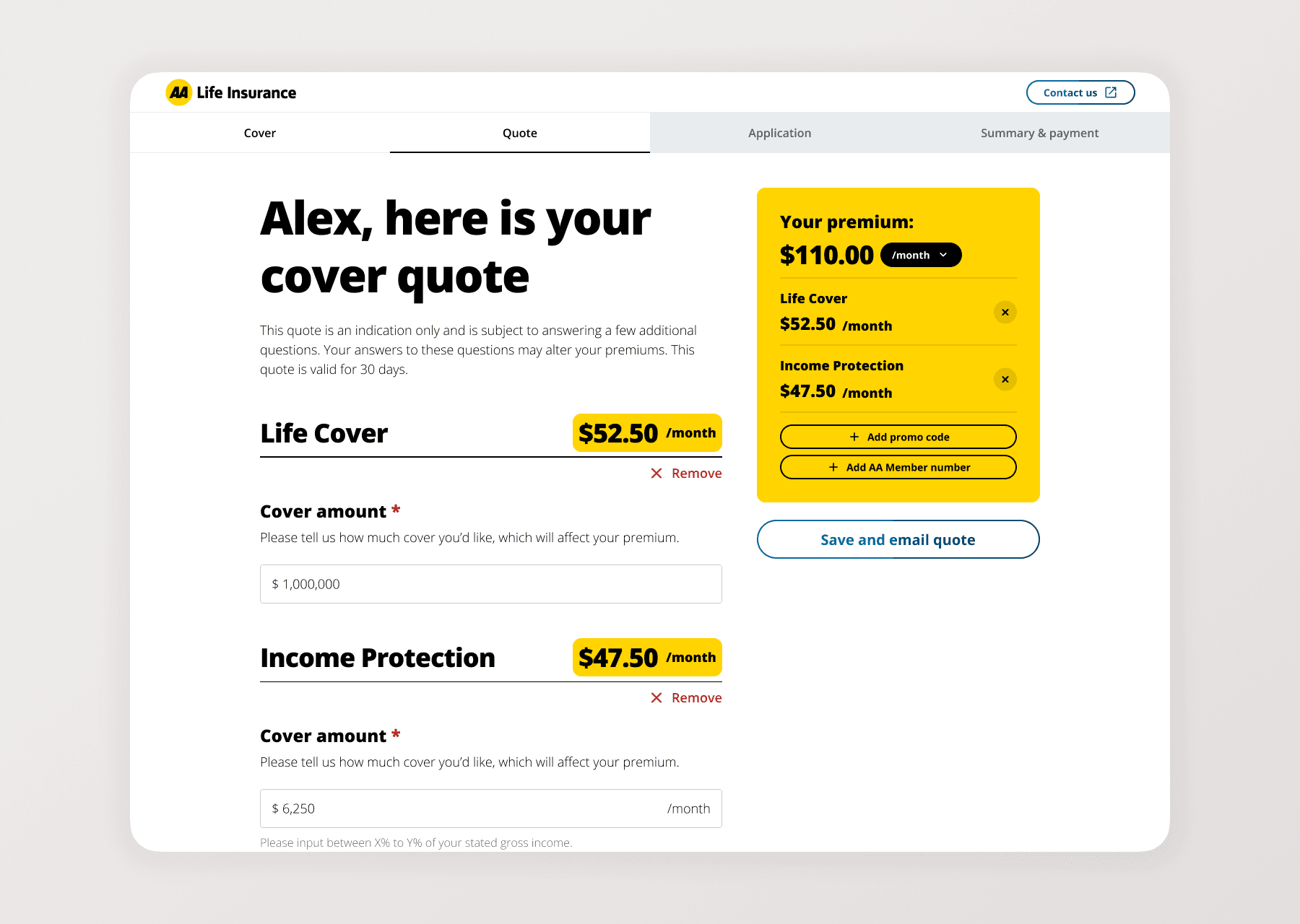
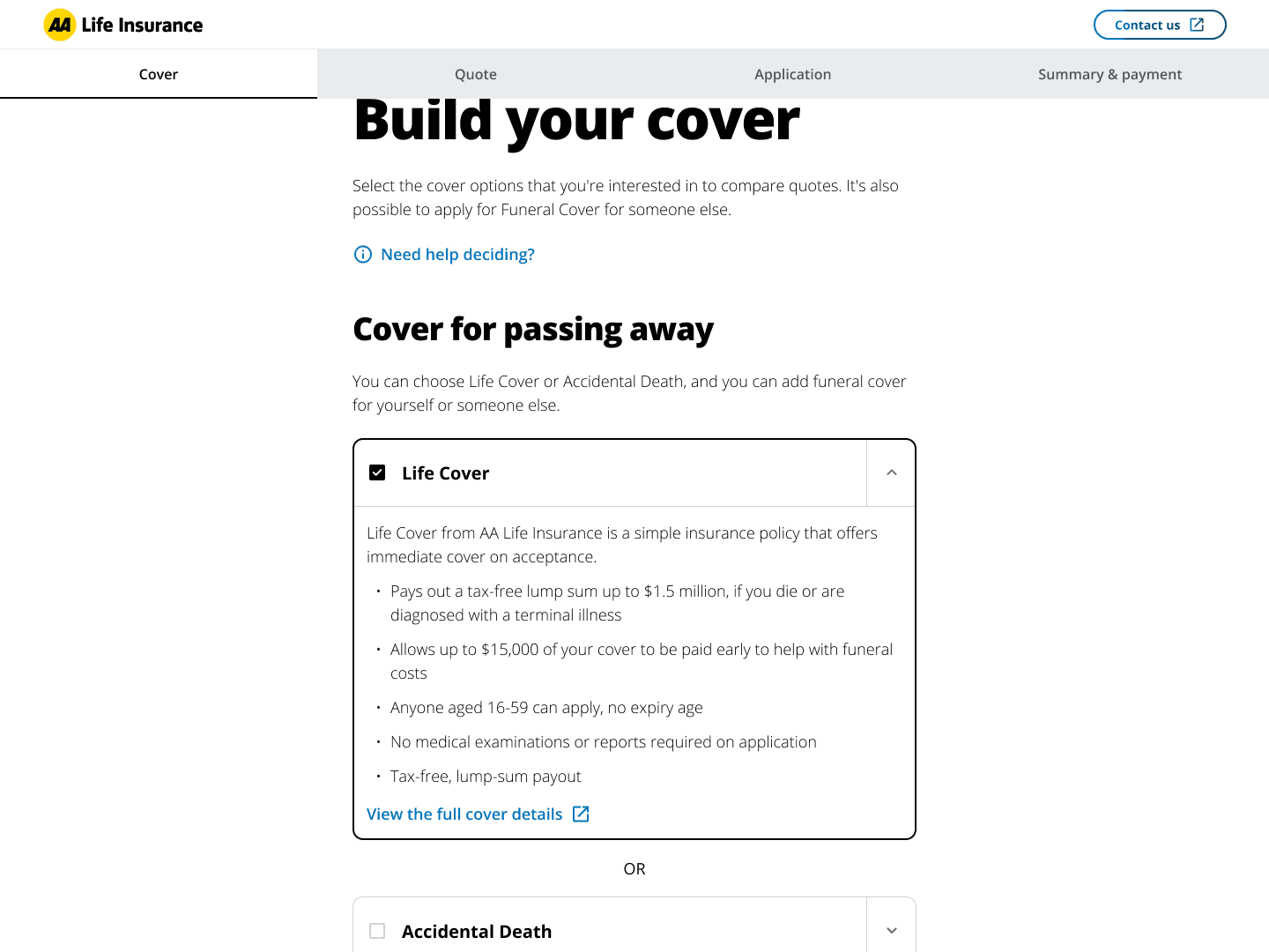
Expandable product cards
The Product Selection screen balances simplicity with detail. Clean, simple cards let confident users move quickly, while expandable panels reveal more information for those who need it. Nobody has to leave the main journey to make an informed decision.
"Help me choose" guidance
For users unsure which products suit them, an optional secondary flow asks a few lifestyle questions and returns personalised suggestions. These recommendations then appear highlighted on the main selection screen. Those who need guidance get it; those who don't aren't slowed down.
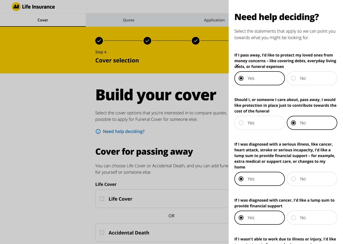
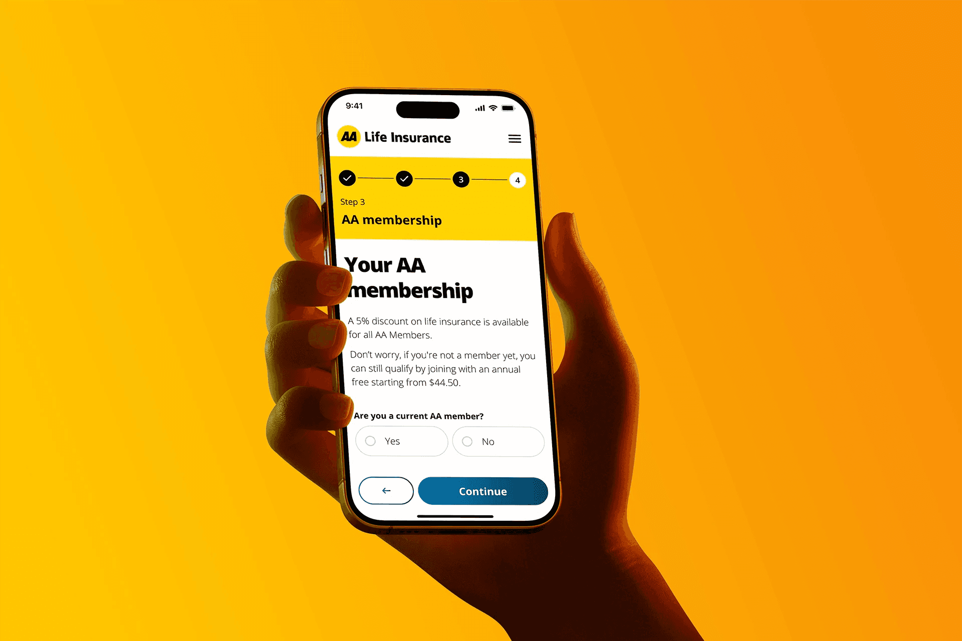
Early value signals
A simple screen early in the journey asks about AA membership, immediately highlighting available discounts. The design reassures non-members they can add their number later, communicating benefit without creating friction.
Results
NZAA's new life insurance journey is awaiting launch in Q2 2026, but stakeholder feedback has been strongly positive. More importantly, our weekly usability testing gave the business confidence that the new journey addresses real user needs rather than internal assumptions.
Every design decision was grounded in observed user behaviour from eight rounds of testing. The result is a validated solution that the business can launch with confidence.
Reflection
Build schedules around participant availability
Our rigid sprint timeline made it difficult to arrange user testing early in the week. Next time, I'd consult with recruitment agencies before finalising timelines with stakeholders. The research schedule should shape the project plan, not the other way around.
Future roadmap
Our testing uncovered feature requirements well beyond initial scope. This backlog of validated opportunities gives NZAA a clear path for continued iteration after launch.
More work


Want to learn more about this project?
I'm looking for my next Senior UX or Product Design role.
Open to opportunities in Sydney, Copenhagen and Amsterdam.