Unifying a fragmented customer portal to cut call centre volume
Increased online access to Pepper Money's loan products by 10% by consolidating fragmented portals into a single self-service platform, significantly reducing contact centre call volume.
Company
Pepper Money
Industry
Finance (Loans)
Duration
16 weeks
The challenge
A loyal Pepper Money customer with a home loan and a car loan faced a fragmented experience. Each product lived in a separate portal with its own design, its own login, its own way of doing things.
The user problem
Different portals meant different credentials to remember. Minimal self-service meant that simple tasks like updating personal details or checking a payout figure required calling the contact centre. The digital experience stopped where basic account management began.
The business problem
NPS and survey data showed the fragmented portals weren't meeting expectations. The technology couldn't be upgraded to deliver the "world-class digital experience" the business wanted. Call volumes stayed high because customers couldn't help themselves.
The goal
Give customers the ability to self-serve online in their own time, when and where they want.
My contribution
I partnered with another UX designer through discovery and early ideation, then took sole ownership of the high-fidelity design phase.
Discovery and ideation
- Co-led analysis of NPS and survey data to define personas
- Facilitated workshops to identify the most common call drivers
- Collaborated on user flow mapping and low-fidelity wireframes
- Validated concepts to establish unified design direction.
Owned the visual design
Leveraged my UI skills to translate validated wireframes into polished, cohesive experiences across the platform.
Produced development-ready deliverables
Managed all final screen designs, ensuring components were ready for efficient handover.
Key insights
Call drivers revealed the highest-value features
Workshops analysing contact centre data showed which tasks generated the most calls. These became the features to surface prominently. If customers were calling to do something, that something needed to be self-service.
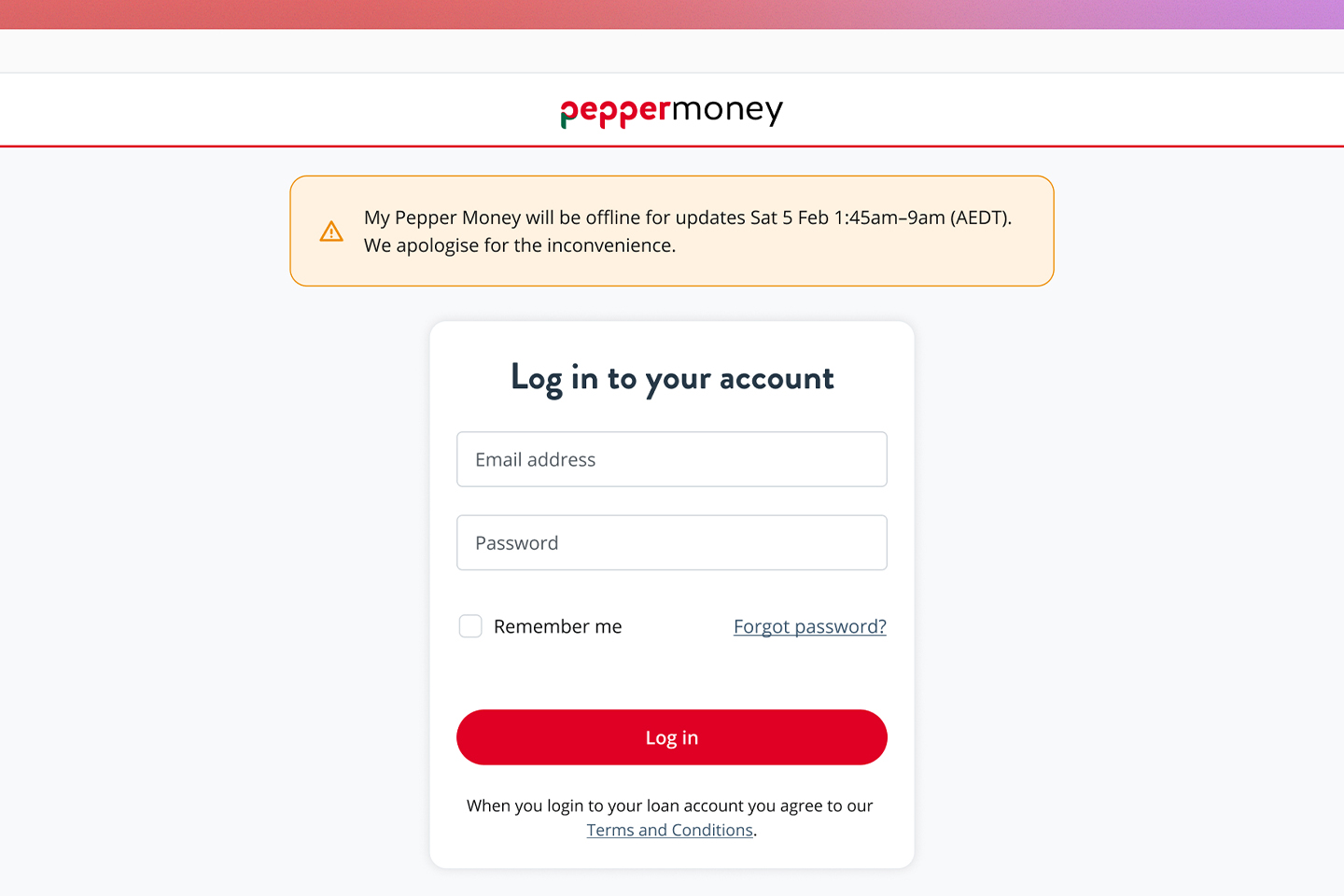
Fragmented login was a major pain point
Customers needed separate credentials for each portal. Unifying login became a top priority. One email, one password, one relationship.
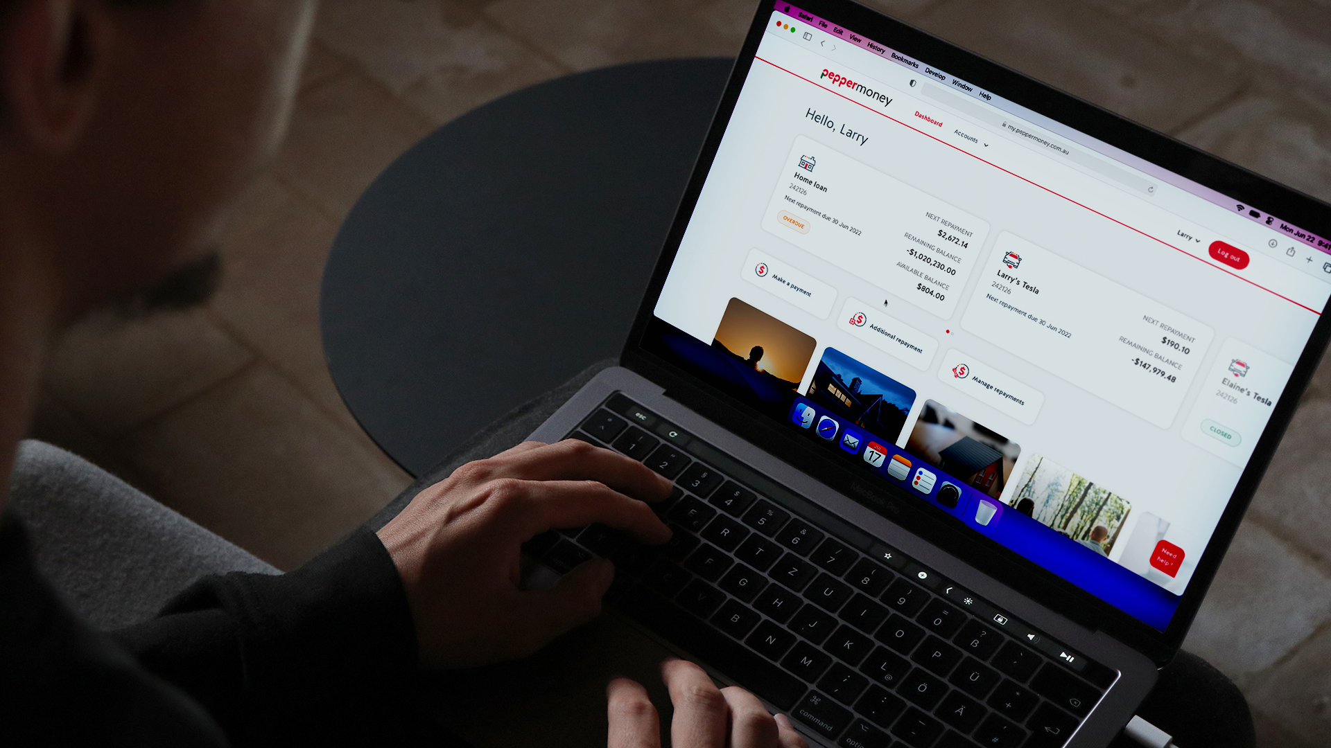
Mobile-first made sense for this audience
Our research pointed to mobile as the primary access point. We designed mobile-first, then ensured the experience translated well to desktop rather than the other way around.
The solution
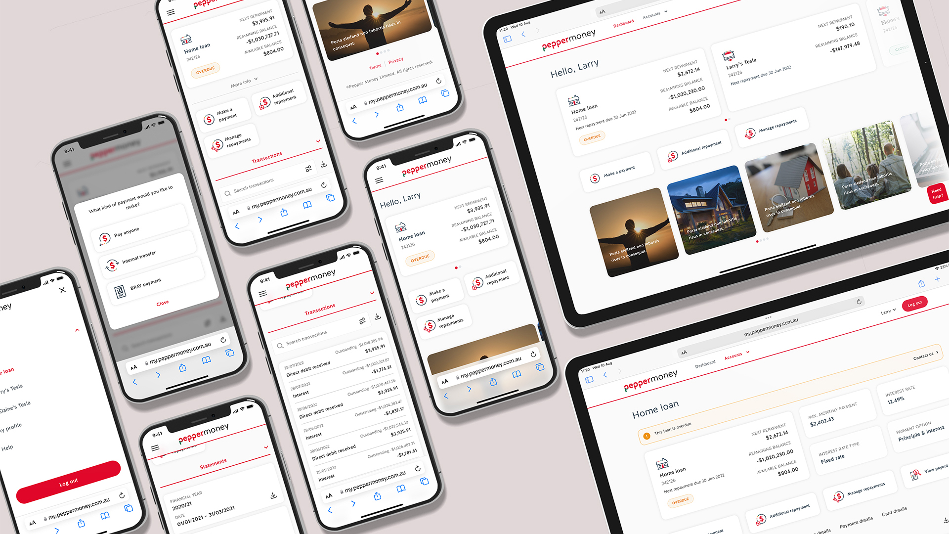
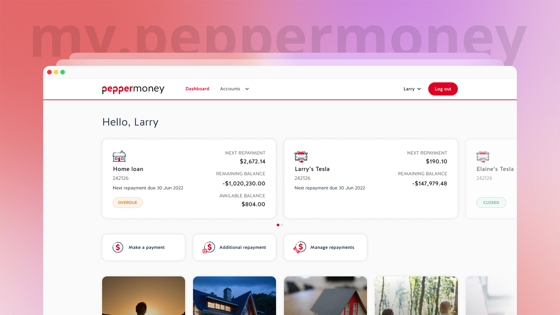
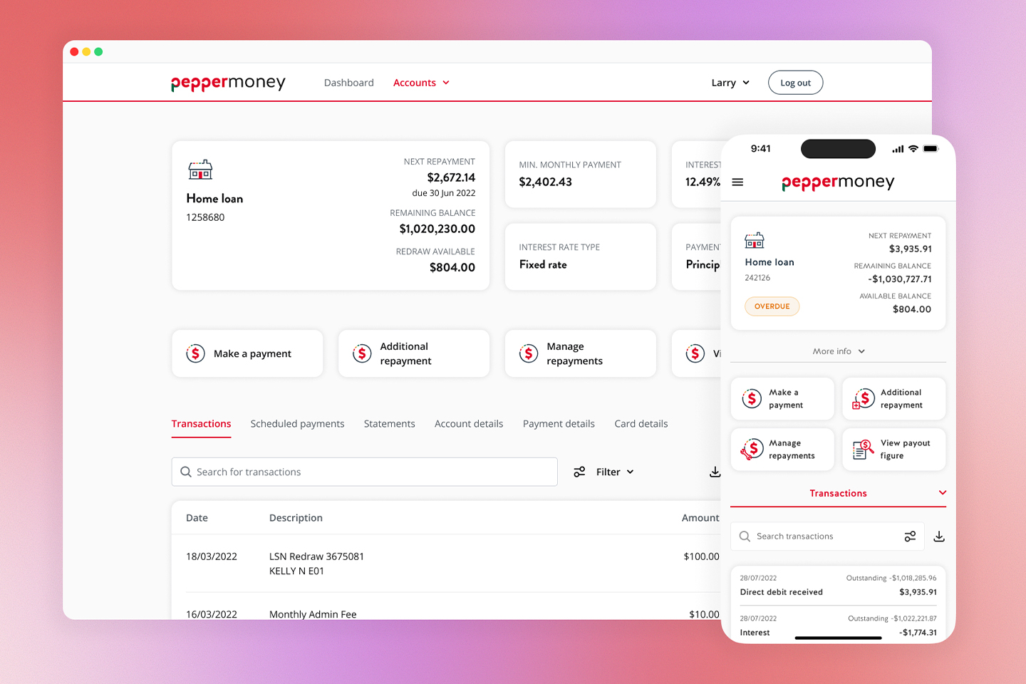
Unified dashboard with loan cards
Each loan product appears as a clean card showing balance and next payment date. On mobile, cards sit in a carousel for easy swiping. For the first time, customers see their complete financial picture with Pepper Money in one place.
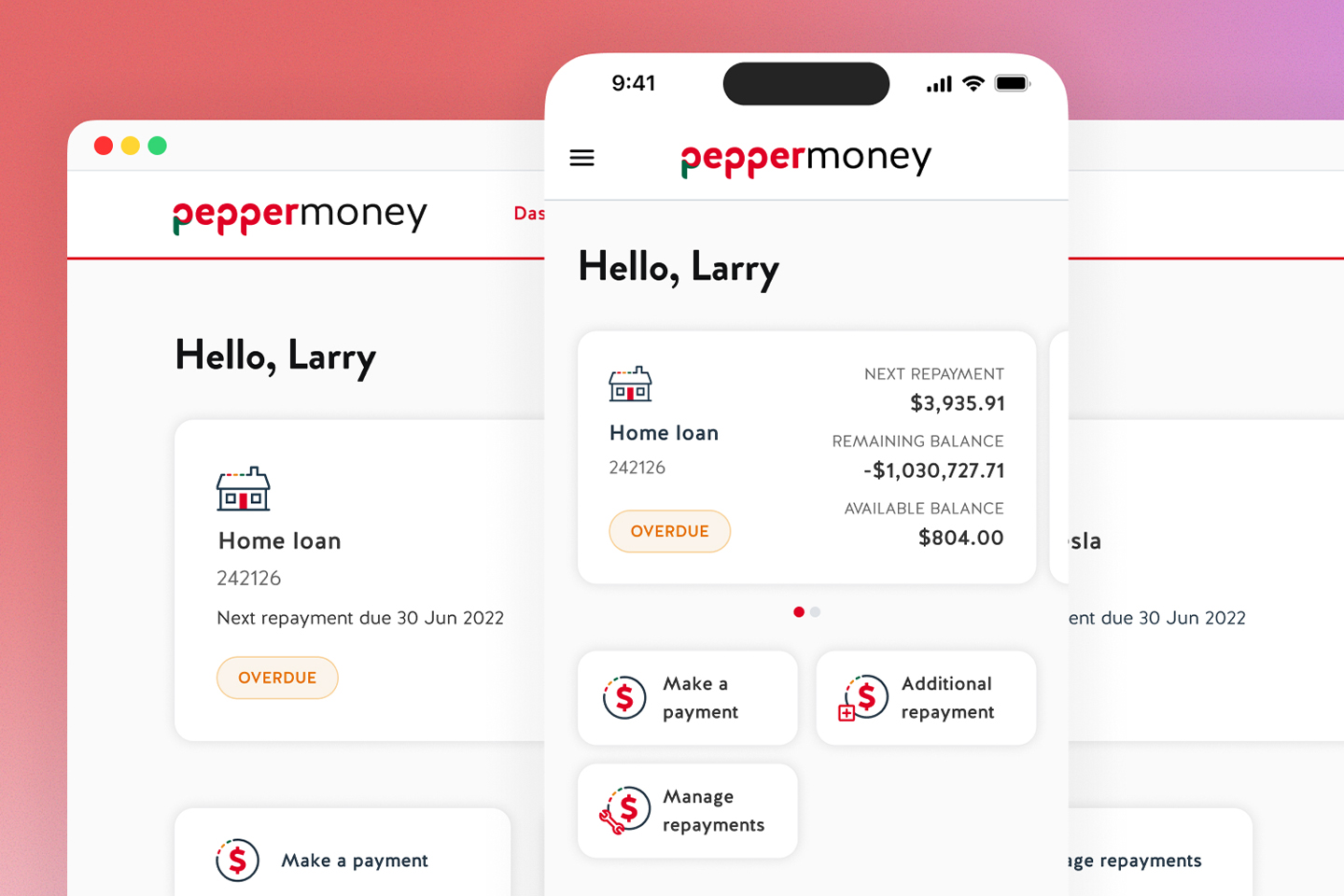
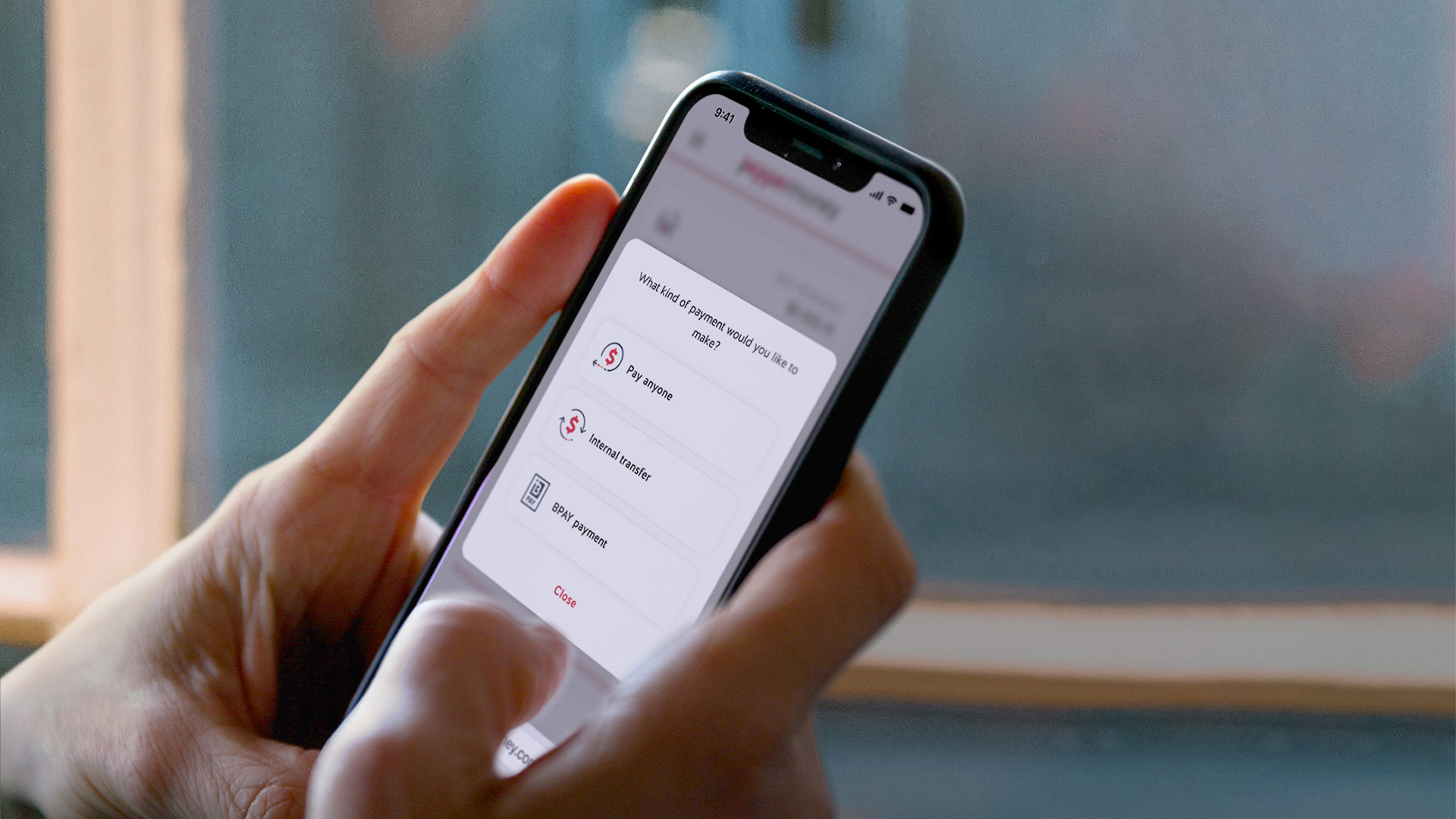
Quick actions for common tasks
We surfaced the tasks that previously required phone calls as prominent quick actions on the dashboard. "Make a payment," "Manage direct debit," "Update details." Global actions appear on the main dashboard; contextual actions appear on individual loan screens.
Single secure login
One front door for all of the Pepper Money customers loan products. We replaced multiple account IDs with a familiar email and password combination, plus 2FA to make entry simple, predictable, and secure.
Results
The launch delivered immediate, measurable impact.
10% increase in online access
to Pepper Money loan products.
Reduced contact centre calls
as self-service adoption grew.
Increased customer satisfaction and retention
through improved experience.
Reflection
Push for direct user validation
We succeeded with internal feedback and data analysis, but direct user testing would have added confidence. I'll always advocate for it.
Timebox stakeholder feedback
Broad collaboration across business units created valuable input but also extended cycles. Clearer timeboxes would maintain momentum while still capturing diverse perspectives.
Desktop deserves another pass
Mobile-first was the right call, but the desktop dashboard could be optimised further. A card view versus list view toggle would better serve users on larger screens.
More of my work
Commonwealth Bank
Modernising CommBank’s business app in two weeks
Designed a high-fidelity proof-of-concept that demonstrated how Commonwealth Bank's outdated business banking app could match the quality of their consumer experience, delivered in a rapid two-week sprint.
Read more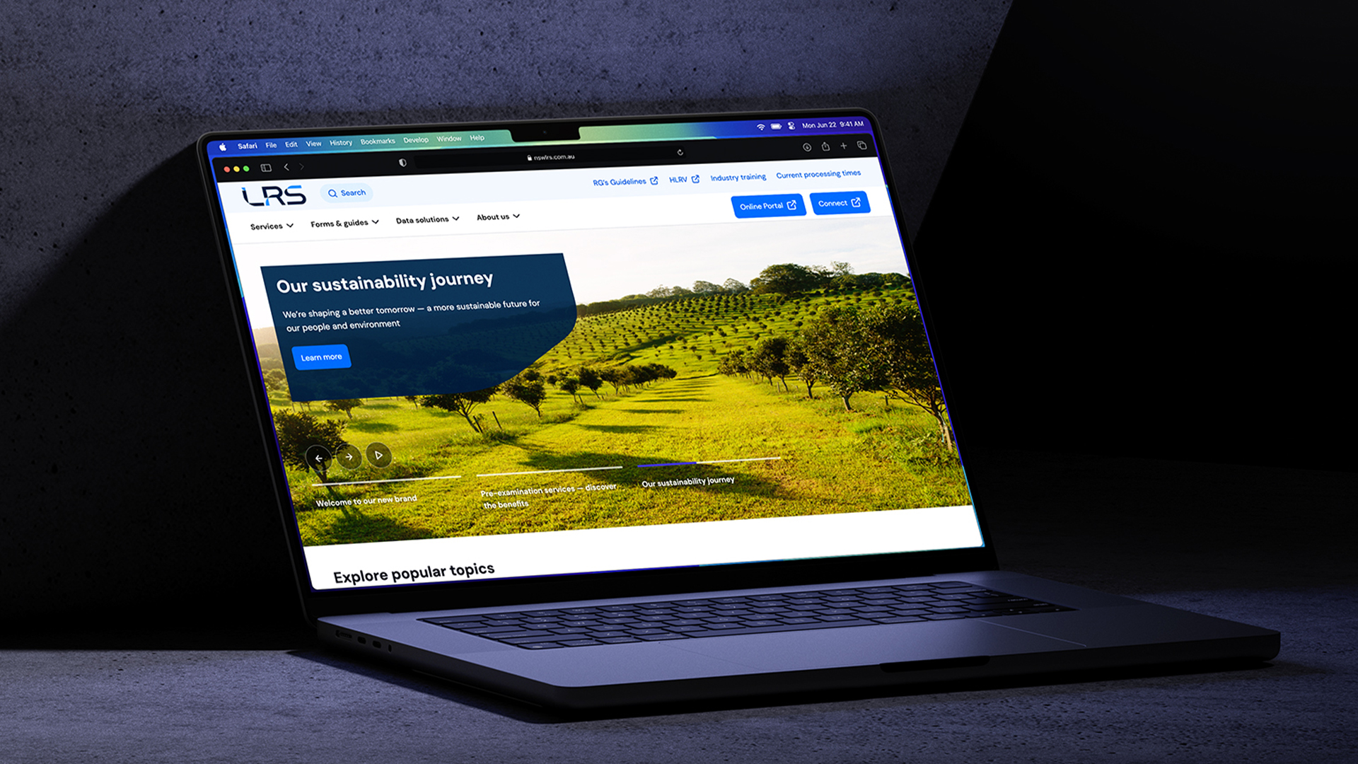
NSW Land Registry Services
Rebuilding a government website from scratch
Redesigned the website for a 160-year-old government service, replacing a navigation so broken that users were resorting to Google and ChatGPT just to find pages on the site.
Read more