Designing Pepper Money's first digital mortgage
Transformed a paper-based mortgage application into Pepper Money's first fully digital, self-service journey, reducing inbound call volume and eliminating manual data entry errors.
Company
Pepper Money
Industry
Finance (Loans)
Duration
12 weeks
The challenge
Applying for a mortgage is already stressful. At Pepper Money, the process made it worse. The entire journey was anchored to the call centre, where advisers navigated PDF forms and Excel spreadsheets that all required manual data entry.
The user problem
A slow, opaque process with no self-service option. No control over the timeline. Manual handling meant errors, which meant delays, which meant more phone calls. In a market where competitors offered streamlined digital applications, this was a problem.
The business problem
A process that couldn't scale. High operational costs from call centre dependency. Error rates from manual data entry. Competitive disadvantage against digital-first lenders.
The goal
Design Pepper Money's first fully digital mortgage journey. Give customers control. Reduce dependence on the call centre. Build something that could compete.
My contribution
As sole UX designer on a major digital transformation, I was the advocate for user experience when direct user access wasn't available. I synthesised insights from internal experts and market research to define, design, and validate the journey.
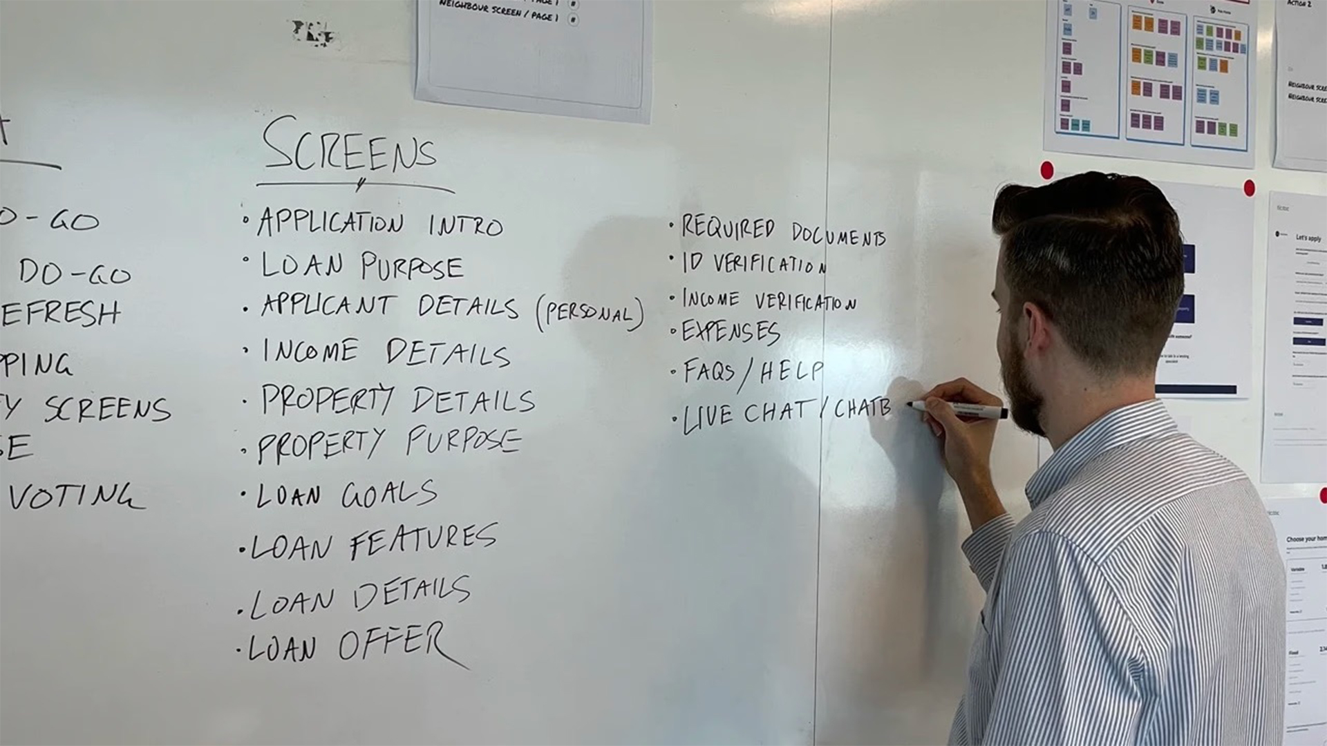
Led discovery workshops
Designed and facilitated sessions with call centre advisers, marketing, and legal teams to map the existing process and its pain points.
Conducted competitor analysis
Ran comprehensive benchmarking of digital mortgage journeys to establish best-practice patterns and show the team how far behind we were.
Created the definitive journey map
Synthesised workshop and research findings into the foundational document that aligned the cross-functional team.
Owned design and validation
Responsible for everything from initial wireframes to final high-fidelity mockups, with iterative validation across product, legal, and brand teams.
Established the design system
Built foundational components in Figma to ensure consistency and scalability.
Key insights
Internal experts revealed the scale of the problem
Discovery workshops with call centre advisers mapped the current journey in painful detail. The sheer number of phone calls required, the reliance on error-prone data entry, the time to completion. When the people running the process tell you it's broken, you listen.
Competitor analysis was the eye-opener
Benchmarking against digital-first lenders revealed the gap clearly. The existing paper-based process wasn't just outdated, it was dramatically behind market standards. This analysis gave the team a concrete target for what "good" looked like.
Legal compliance shaped every decision
Working closely with legal, we ensured each step provided necessary disclosures while keeping the experience efficient. Compliance and good UX aren't opposed if you design them together from the start.
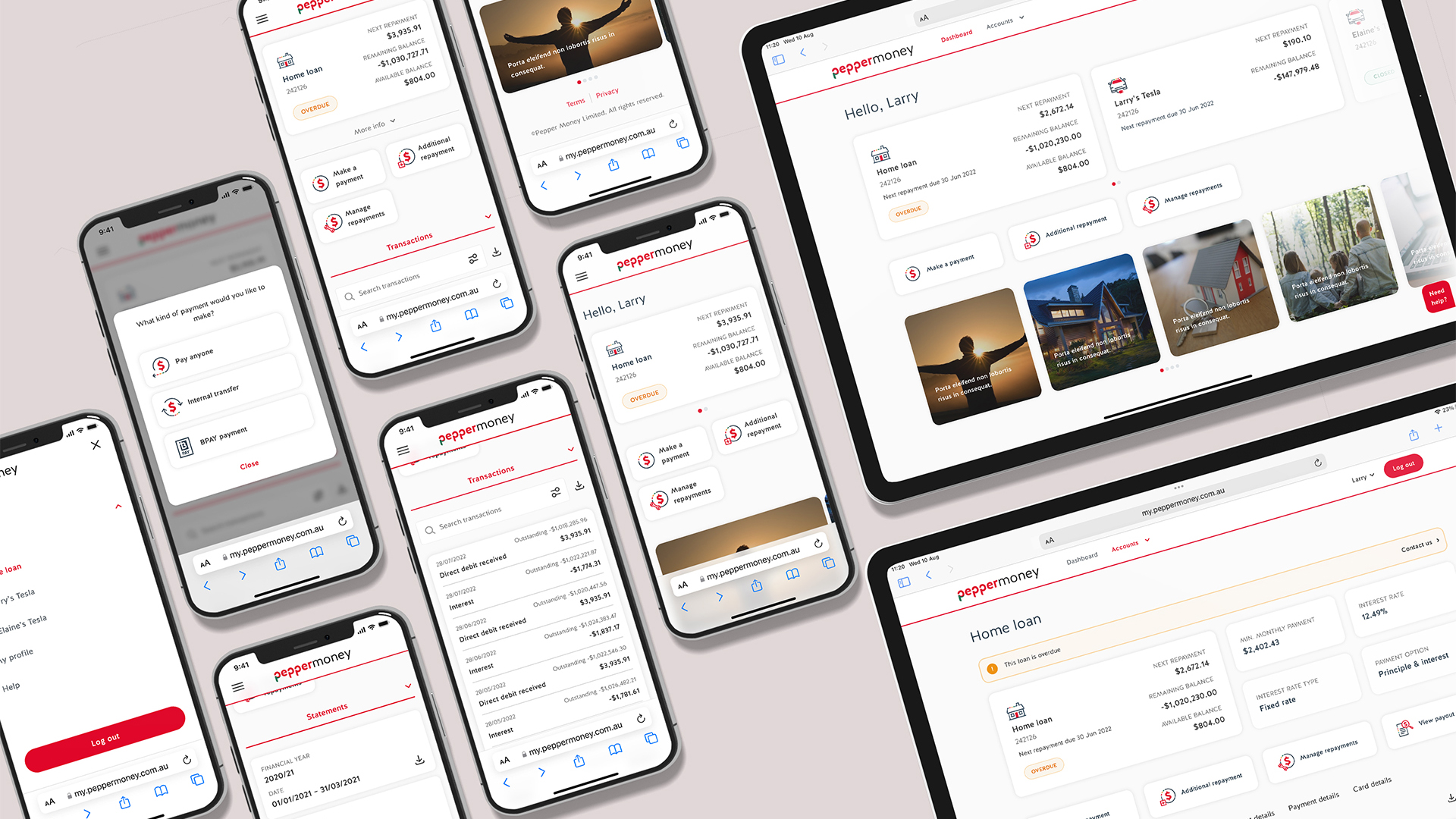
The solution
The goal was taking an intimidatingly long form and make it feel manageable. We achieved this by:
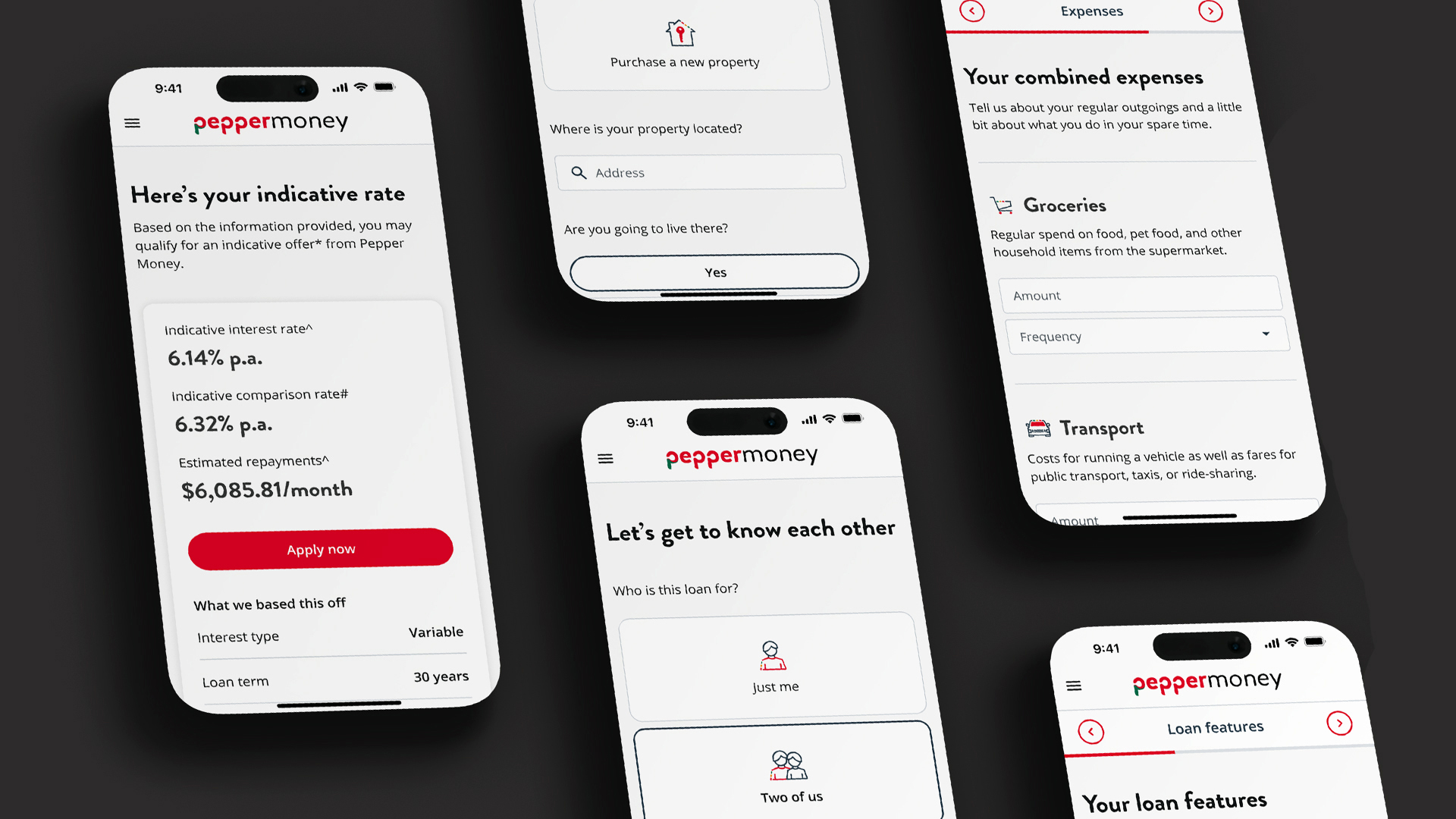
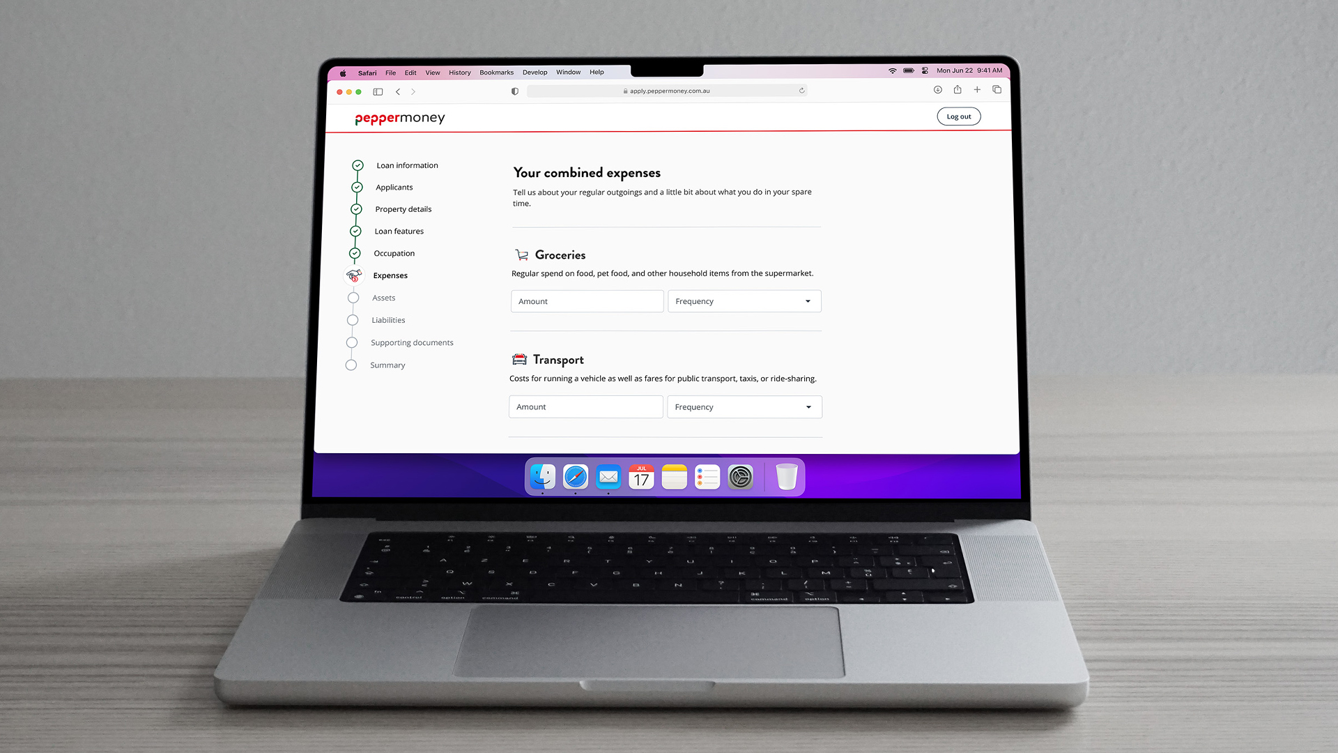
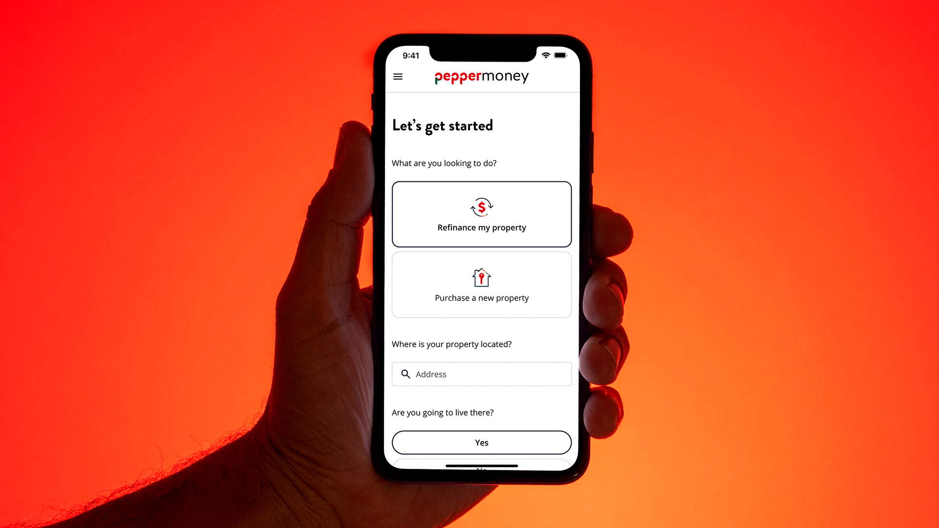
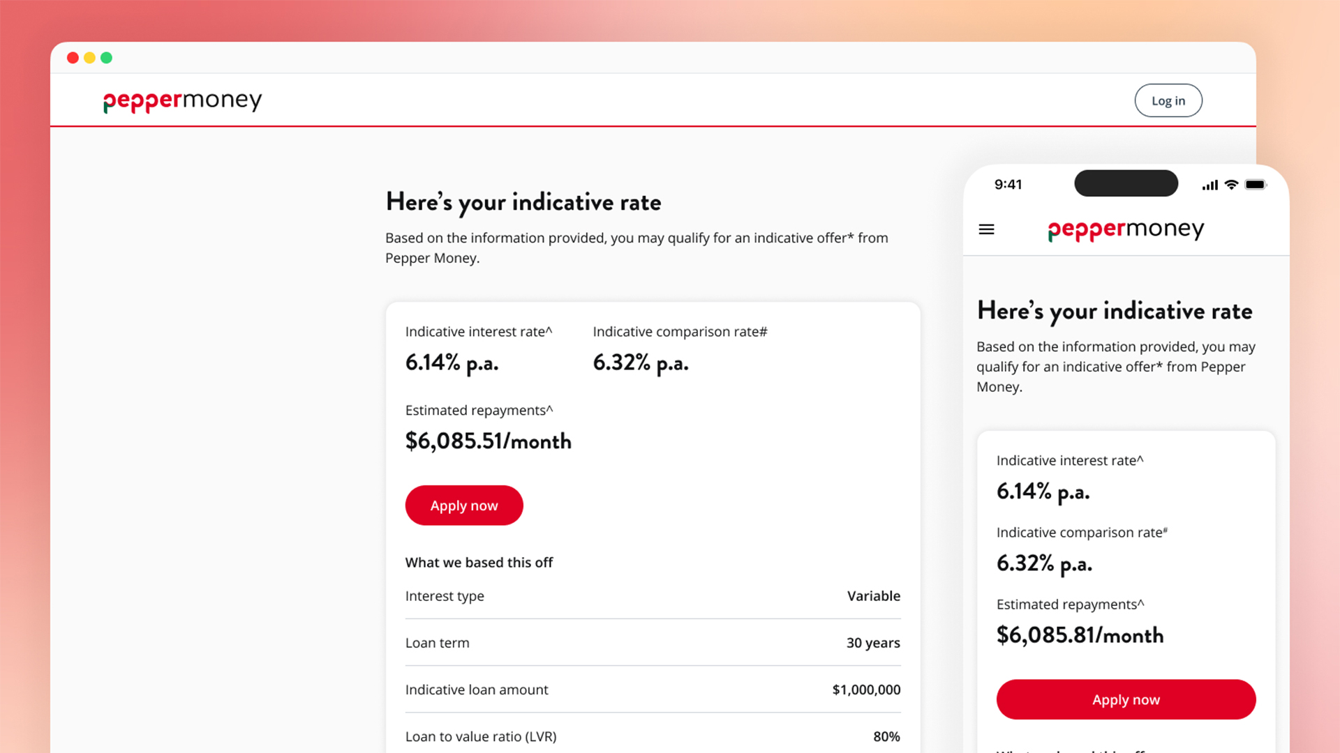
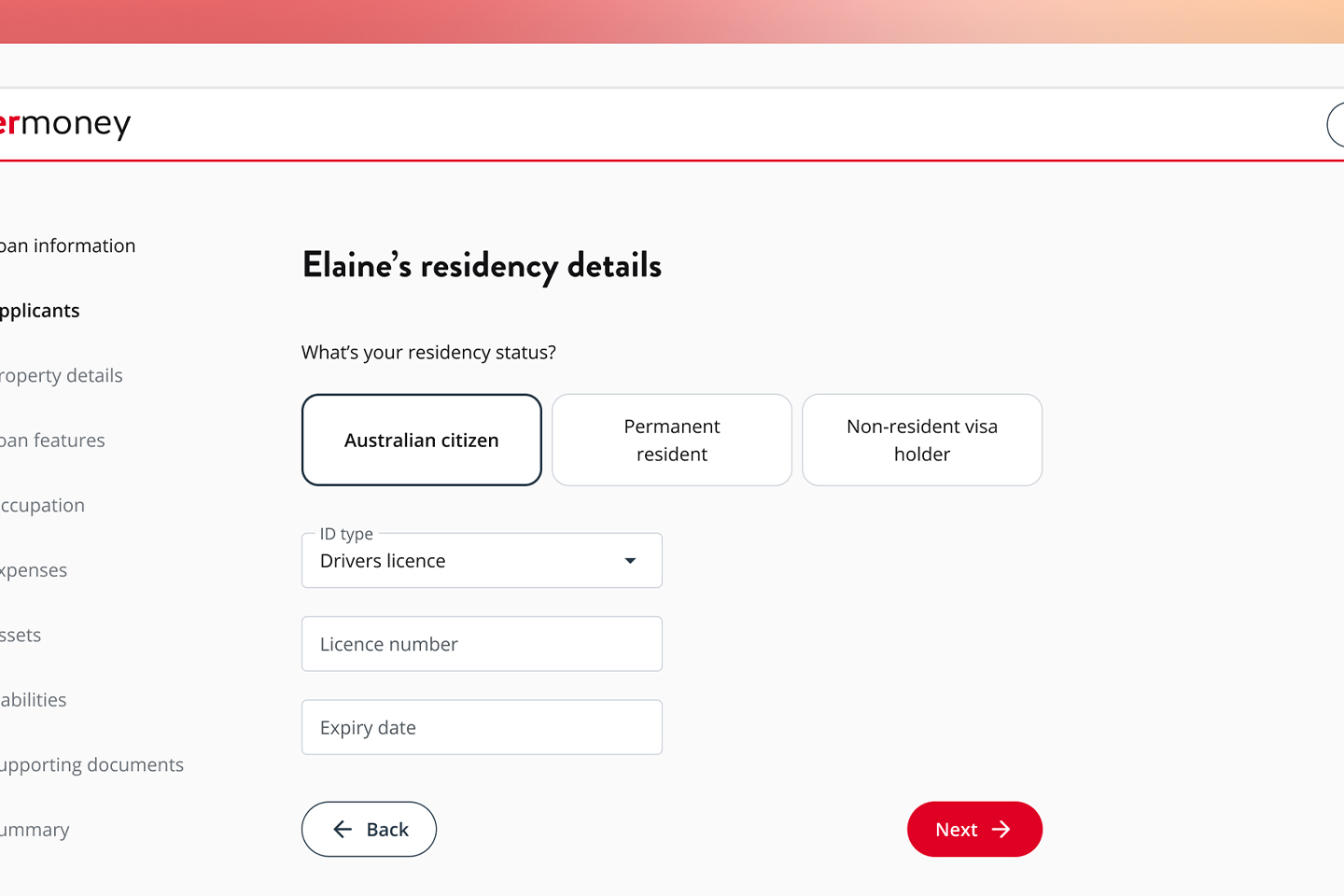
Breaking the form into logical steps
We divided the monolithic application into small, focused sections. Each screen addresses a clear task with large, accessible input fields and clean layouts. The journey feels achievable rather than overwhelming.
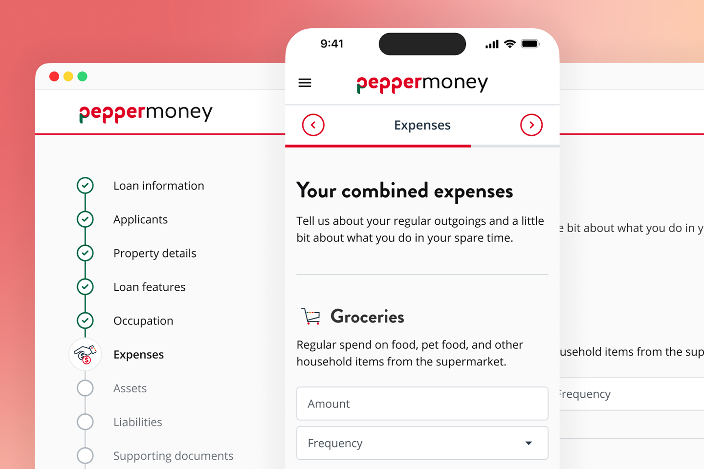
Progress bar as navigation
On desktop, a persistent progress bar shows completion and acts as a navigation tool, letting users jump between sections. For mobile, we designed a solution that provides the same transparency within screen constraints. Users always know where they are and what's left.
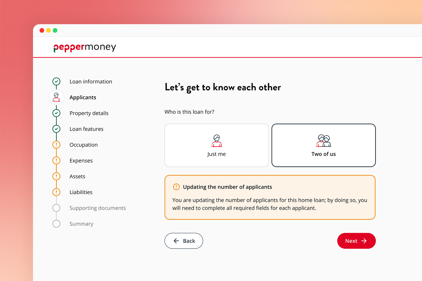
Non-linear navigation with clear error states
Mortgage applications aren't linear. People go back, check details, correct information. The progress bar highlights complete sections, incomplete sections, and sections with errors. Users see exactly what's missing and can navigate directly to fix issues.
Results
The launch marked a major strategic success for Pepper Money.
For customers
- True self-service for the first time.
- Applications at their convenience, on their schedule.
- The streamlined process addressed the high drop-off rate of the old system.
For the business
- Reduced inbound calls and call centre dependency.
- Eliminated manual data entry errors.
- A new digital channel supporting direct-to-client growth strategy.
Reflection
Always advocate for direct user research
We built successfully on internal expertise and competitor analysis, but testing with real users would have added confidence and likely accelerated decisions. I'd push harder for this next time.
Structure feedback to maintain momentum
With numerous stakeholder sign-offs, feedback loops sometimes extended longer than they should. Clear decision-making gates would help balance iteration with forward progress.
This is a blueprint, not just a product
The digital mortgage journey established patterns that can scale to other loan products. The platform's analytics capabilities now enable data-informed iteration across the ecosystem.
More of my work
Pepper Money
Unifying a fragmented customer portal to cut call centre volume
Increased online access to Pepper Money's loan products by 10% by consolidating fragmented portals into a single self-service platform, significantly reducing contact centre call volume.
Read more
Commonwealth Bank
Modernising CommBank’s business app in two weeks
Designed a high-fidelity proof-of-concept that demonstrated how Commonwealth Bank's outdated business banking app could match the quality of their consumer experience, delivered in a rapid two-week sprint.
Read more